
Monday, June 27, 2011
Sunday, June 26, 2011

Monday, June 20, 2011
5 Cats, A Girl, and The Pizza Place
I'm feeling a bit overwhelmed and exhausted lately. I haven't really been doing much, but I can't seem to get myself together. I think it is the allergy season. It has completely knocked my on my arse. I have so much I want and need to do, but most days I can't drag myself off of the couch, and have trouble just lifting my arms. I'm currently stuck in a migraine stupor, which isn't really helping. Yet, I can't sleep.
Also, I want pizza, and not that frozen gluten free crap. I want Pizza Place pizza! I could really go for my favorite deli sandwich, too.
These are the moments I long to be normal.
Also, I want pizza, and not that frozen gluten free crap. I want Pizza Place pizza! I could really go for my favorite deli sandwich, too.
These are the moments I long to be normal.
Monday, June 13, 2011
Sally Hansen Crackle Overcoat Swatches and Review
I bought these before they were reviewed, because I was afraid I wouldn't be able to find them. Also, they were on sale. I have been a bit disappointed, but not enough to return them, and I think they may have grown on me. First, the negatives. The weird wrapper on the cap is dreadful, and turns around freely making it difficult to open and close the bottles. Some of my brushes were wonky, but nothing too bad. I have a MAC, that I paid serious cash for, that came with a brush that looked like it had a previous life in a kindergarten art class. Wonky brushes don't kill the deal for me, but this one tends to stick in weird positions, because the polish dries on it so quickly.
The real problem with these, the thing that can't really be fixed, is the formula. It is very thin, but also clumpy, like bad potato soup. Once I figured out how to apply them, it was okay, but with so many other crackle options, there is no need to have to try so hard.
I do like the jelly-like finish of Distressed Denim and Smashed Cherry, and neeeeded a gold crackle, so am glad to have Antiqued Gold, even if it is disappointing.
I was told that it was best to use a thick coat, so that's what I did in these first swatches. They are without topcoat, and over Sally Hansen Insta-Dri Jumpin' Jade.
I was in a hurry to get these done, so I swatched on my right hand, which made for some awkward photography.
The real problem with these, the thing that can't really be fixed, is the formula. It is very thin, but also clumpy, like bad potato soup. Once I figured out how to apply them, it was okay, but with so many other crackle options, there is no need to have to try so hard.
I do like the jelly-like finish of Distressed Denim and Smashed Cherry, and neeeeded a gold crackle, so am glad to have Antiqued Gold, even if it is disappointing.
I was told that it was best to use a thick coat, so that's what I did in these first swatches. They are without topcoat, and over Sally Hansen Insta-Dri Jumpin' Jade.
 |
| Smashing Cherry and Distressed Denim |
 |
| Vintage Violet and Antiqued Gold |
Sunday, June 12, 2011

Saturday, June 11, 2011

Friday, June 10, 2011

Thursday, June 9, 2011

Wednesday, June 8, 2011

Tuesday, June 7, 2011

Monday, June 6, 2011


Saturday, June 4, 2011
Wrong Number
Texting the wrong person can be far more dangerous than calling the wrong number, because you've already said what you were going to say before anyone can inform you of your mistake. Case in point, I just received the following text:
"Hey its mikey u have a joint to sell *Mikey's full name*"
Mikey, whoever you are, if your text could be used as evidence against you or a friend in a court of law, you may want to double check the number before hitting send.
UPDATE- A few minutes after I sent him a message telling him he had the wrong number, I received a response:
"Who are you *Mikey's full name*"
I considered telling him I was a cop, but no response seemed almost as fun. When I call a wrong number, I don't demand that person's information. I fucked up, not them. I can't imagine the amount of entitlement this guy must have to think I owe him something.
I should also point out that my number is one of those that is often dialed by mistake. There are lots of threes, and the most common first three numbers for local cell phones are only different by one number, I have a three, but others have a two. Anyway, a couple of years ago, I received a string of increasingly escalating voicemails from a mother trying to locate her son. At one point, there was mention of calling the police. The last message was her apologizing to me. I guess since I don't get any interesting phone communications intended for me, I'm lucky to be able to enjoy those intended for others.
*name removed to protect the moron's privacy
Guys and Dolls
Cross-posted here
A couple of days ago, when I checked Etsy, I was drawn into reading an article supposedly about the origin of pink as a color associated with girls and femininity. I didn't make it through the first paragraph before a brooding but subtle and familiar bitterness set in. This isn't something originated by Etsy, but I am always disappointed to see it perpetuated, especially by a company to which I give money, business, and traffic. Of all of the problems I have with Etsy, this probably isn't the largest, but it is one I didn't expect to encounter. This is a post I didn't want to write, but couldn't walk away from.
My first objection is to the idea that a girl is less than a boy, or, for that matter, that a boy is less than a girl. It has always bothered me when parents hope desperately for a child of a certain sex. I cannot and will not be convinced that two girls are inherently more similar than a boy and a girl, simply because of their sex. Siblings may turn out to be very different from one another, or they may be quite similar, whether they are male or female. I know parents argue that they want the experience of raising a girl or a boy, or both, but I think the experience of raising each child is unique, and that the differences between a male and female child have more to do with the expectations of the parent than with the child.
Our culture is steeped in sexism, much of it blatant, but the persistent, latent sexism inherent in the notion that an unborn child's life will be wanted and valued more if it is of a certain sex, is one of the most disturbing bits of discrimination. Not only is this view ubiquitous, and almost always unquestioned, as it is a view we've come to accept as a general truth, but it is targeting people who aren't even people yet! Apparently, there aren't enough people on the planet to discriminate against, we must make more.
My second objection is to the interchangeable usage of gender and sex. They are not the same thing. Also, a person is not necessarily a boy or a girl, male or female. Neither sex nor gender are binary. While people brag about their own tolerance and open mindedness, about how it is perfectly fine for a boy to wear pink, as long as he's wearing "boy clothes", a greater issue is missed. People are generally willing to be tolerant as long as that tolerance is comfortable, as long as it at least skirts their community definition of normalcy. As long as they can assign inanimate objects (like clothing) a gender, they don't have to think about the gender or sex of the person using those objects, or they judge that person harshly for not using the properly gendered items. A baby in a dress is a girl, a man in a dress is confusing. People don't like to be confused.
I could delve into this more deeply, but this really isn't the venue. In the grand scheme, these small things may seem just that, small, and unimportant. But, the things we say without thinking, the ideas we regurgitate without rumination, those are the things that are important. Those are our world-view, unedited, and sincere. Those are the things that shape all of our other opinions. Those are the things we must examine if we want to make the world, and ourselves, better.
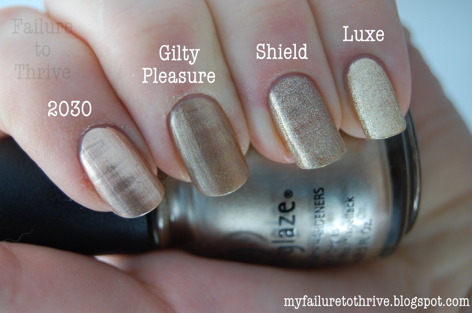
Gold Polish Comparison Swatches Part 2
I seem to have accidently created a nail polish blog. The recent abundance of polish posts can be, in part, attributed to my recent Official Stash Reorganization Project. While I've been compiling and categorizing, I thought it would be a good opportunity to post swatches, for my own purposes, mainly, but I hope others might find them helpful. Nail polish is something I enjoy, and will remain a part of this weird little, ill-read blog, but I hope to get back into the swing of posting my random thoughts, and some pictures of cats. You know, the important things in life.
Until then, there are the rest of the gold polish swatches. All photos are clickable and taken in a lightbox, and the polish is shown with a topcoat, but without a basecoat. Part 1 is here. Please pardon the lobster hands and overly acetone-d cuticles.


Until then, there are the rest of the gold polish swatches. All photos are clickable and taken in a lightbox, and the polish is shown with a topcoat, but without a basecoat. Part 1 is here. Please pardon the lobster hands and overly acetone-d cuticles.


Glitter! I love shiny things, and an abundance of glitter never fails to make me happy. I really can't believe I don't have more gold glitter polishes. I did two coats of each to show the relative density of glitter. Milani Jewel FX Gold (I hope the official polish namer didn't get paid too much for that one) is a bit of a pain to layer over things, as it's difficult to distribute the glitter evenly, but it looks great by itself, as demonstrated by Scrangie.
Comet and Fireworks were both Holiday 2010, limited edition releases by Wet 'n' Wild. I had assumed that they were just the same polish in different bottles (yet, I bought both), but am glad to see I was wrong. Basically, Fireworks is comet with small silver glitter. I think WnW has released Fireworks under a different name (as they tend to do) at some point, and hope they do so again, especially if they also bring back my favorite of that collection, Tipsy.
Gold Rush is the perfect small, gold, glitter topcoat, and I suggest if you can still find the Cover Girl Boundless Color Collection, that you snatch it up, along with City Lights (tiny holo glitter topcoat).

Thursday, June 2, 2011
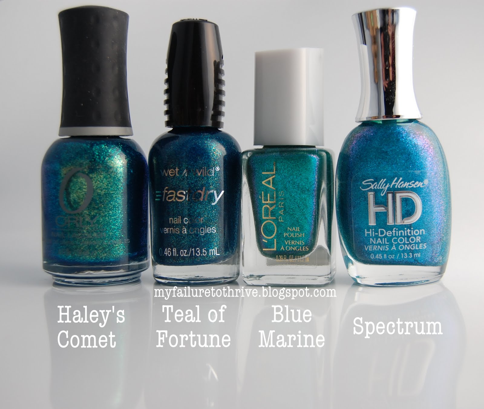
Gold Polish Comparison Swatches Part 1
Here are a few comparison photos I did yesterday. They are mostly golds (all of the commercial golds in my collection, that I could find easily - my mom has custody of at least one). I tried to match them up by similar color, but I haven't worn some, and don't remember others, so I did a few repeats to be thorough. All are without base coat (sorry about the ridges), but with topcoat and taken in my DIY lightbox, unless otherwise noted. My cuticles are terrible, especially after having been subjected to copious amounts of acetone. Consider yourself forewarned.
The pictures are large (and clickable) to show detail, so they may take awhile to load. Most of the pictures are hiding behind the cut.
Let's get the non-golds out of the way.
Zoya Tiffany and Wet 'n' Wild Waves of Enchantment are similar, but WoE is brighter and pinker with smaller gold particles.
OPI What's With the Cattitude and Wet 'n' Wild Bird Bath are dupes as far as I can tell. I walked around and checked them in different light, but couldn't differentiate the two. My super pale skin with yellow undertones makes this look different on me than it does on the rest of humanity. I tried to edit it so that it appears the way it does on everyone else, but I gave up.


The pictures are large (and clickable) to show detail, so they may take awhile to load. Most of the pictures are hiding behind the cut.
Let's get the non-golds out of the way.
 |
| no topcoat |
 |
| no topcoat |

sunlight
Subscribe to:
Posts (Atom)